Silk screening, also called screen printing, is a proven way to add crisp logos, legends, safety icons, and part numbers to metal parts and enclosures.
When you need brand colors, broad fills, or durable markings that align perfectly with cutouts and hardware, silk screen holds its own against pad printing and laser marking. This guide covers when to use it, how to prep files, what inks and pretreatments matter, and how to keep production smooth.
What Is Silk Screening on Metal?
Silk screening—also called screen printing—is a proven way to add crisp logos, legends, safety icons, and part numbers to metal parts and enclosures. When you need brand colors, broad fills, or durable markings that align perfectly with cutouts and hardware, silk screen holds its own against pad printing and laser marking.
Silk screening transfers ink through a mesh stencil
Silk screening transfers ink through a mesh stencil (the “screen”) onto a part. Open areas in the stencil allow ink to pass; blocked areas do not. On metals (aluminum, CRS, stainless, galvanneal), adhesion and cure are controlled with the right pretreatment, ink system, and oven profile.
When Silk Screen Beats Alternatives
(If you need micro text, serialized codes, or grayscale permanence, consider laser marking. For small, multicolor logos on curved parts, pad printing can help.)
When Silk Screen Beats Alternatives
- Brand-true color: Pantone matching across large areas and panels.
- Big graphics & fills: Solid fields, legends, icons, scales without banding.
- Cost-effective repeats: Economical on medium to high volumes once the screen is made.
- Texture control: Gloss, satin, or matte clears; tactile varnishes.
Common Applications
Rackmount faceplates and bezels (1U–4U)
Common Applications
- Industrial control panels and operator interfaces
- Safety icons, port labels, and rating plates
- Appliance and medical device housings
- Branded door panels, covers, and chassis
Design for Manufacturability (DFM) Checklist
Vector art first: AI, EPS, SVG, or PDF. Convert fonts to outlines.
Art & File Prep
- Stroke/line weight: Minimum 0.2–0.25 mm (0.008–0.010 in) for consistent bridges.
- Text size: Cap height ≥ 2.0–2.5 mm for field readability; larger for textured powders.
- Color callouts: Provide Pantone codes, finish (gloss/satin/matte), and any halftone notes.
- Registration: Keep critical graphics ≥ 2–3 mm from bends, rivets, PEMs, and door seams.
Placement & Datums
- Reference one primary edge + one hole (or two holes) for repeatable alignments.
- For multi-color prints, include registration marks in the art (removed or masked at production).
Keep-Outs & Masking
- Avoid printing on ground pads, EMI bond points, and threaded features.
- If parts are powder coated first, call out “silk screen after powder” and provide a mask map if any no-print zones are required.
Materials, Pretreatments, and Inks
Aluminum (5052/6061): Great printability. Chromate/chem-film improves adhesion and conductivity options.
Substrate Notes
- CRS/Galvanneal: Clean, phosphate, or e-coat/powder first for corrosion control; then print.
- Stainless (304/316): Degrease and scuff for better wetting; use high-adhesion inks.
Surface Condition Targets
- Cleanliness: No oils, cutting fluids, or silicone.
- Roughness: Light scuff (e.g., Scotch-Brite) improves mechanical key on smooth coats.
- Temperature/Humidity: Stable shop conditions reduce viscosity drift and pinholes.
Ink Systems (Typical)
- Two-component epoxy inks: Strong adhesion and chemical resistance on coated metals.
- Polyurethane/alkyd systems: Good flexibility; use when parts flex or see impact.
- UV-curable inks: Fast cure, low VOCs; ensure substrate/finish compatibility.
- Clear coats: Optional to add abrasion and solvent resistance; specify gloss level.
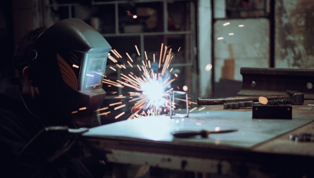
The Silk Screening Process (What Happens on the Floor)
Artwork & Color Proof – Vector check, line-weight verification, Pantone match, and placement proof from defined datums.
What Happens on the Floor
- Screen Creation – Mesh selection (e.g., 230–305 for fine detail; lower counts for heavy laydowns), exposure, and hardening.
- Fixturing – Pin nests or edge stops to lock mark-to-feature location.
- Print Pass – Squeegee pressure, angle, and flood set for consistent laydown.
- Cure – Thermal or UV per ink TDS (e.g., 150–180 °C dwell for 10–20 min, or UV dose per spec).
- QC – Visual check, Pantone delta-E, adhesion (crosshatch), and solvent rub tests.
- Pack & Protect – Interleave or film to prevent scuffing; note cure time before bagging.
Tolerances & Quality Targets
Color: Pantone match within ΔE ≤ 2–4 (specify your tolerance).
Tolerances & Quality Targets
- Registration (single color): ±0.25–0.40 mm (±0.010–0.016 in) typical with fixtures.
- Registration (multi-color): ±0.30–0.50 mm depending on mesh and part size.
- Adhesion: Pass ASTM crosshatch; specify test solvent (IPA, MEK rub count) if critical.
- Gloss: Define in GU at 60° (e.g., 10 GU matte, 30 GU satin, 80 GU gloss). See ISO 2813 for 20°/60°/85° geometry.
Interactions with Finishes
Powder coat: Most common. Print after powder for best color fidelity; specify texture level (fine texture makes tiny text look softer).
Interactions with Finishes
- Bare aluminum + chem-film: Excellent adhesion and conductivity underneath.
- Anodized aluminum: Print on sealed anodize for best stability; confirm ink compatibility and adhesion.
- Stainless: Print on cleaned, scuffed surface; consider a clear topcoat in harsh washdown.
Cost & Lead Time Levers
Consolidate colors to fewer Pantones.
Cost & Lead Time Levers
- Standardize icons and legend templates across SKUs.
- Avoid micro-type on textured powders to reduce scrap.
- Batch by color to minimize changeovers and screen cleans.
- Provide flat patterns + assembly views so placement is unambiguous.
Silk Screen vs. Pad Printing vs. Laser Marking
Brand-true color, large areas, economical at scale
Method, Strengths, Limitations, Best Use
| Method | Strengths | Limitations | Best Use |
|---|---|---|---|
| Silk Screen | Brand-true color, large areas, economical at scale | Screen cost, limited micro-detail on textures | Panels, big legends, logos, safety icons |
| Pad Printing | Small areas, uneven/curved surfaces, decent detail | Smaller image size, color steps add time | Buttons, knobs, small curved features |
| Laser Marking | Permanent, micro text, serial/QR codes | Monochrome (contrast only), no broad fills | Traceability, fine legends, outdoor wear |
FAQs
With proper pretreat, ink choice, and cure, prints resist abrasion and common solvents.
How durable is silk screen on powder coat?
Add a clear topcoat if the part sees heavy chemical exposure.
Can you match my brand color exactly?
Yes—spec a Pantone (coated/uncoated). We verify with a spectro and can hold ΔE within your tolerance.
What’s the smallest text you recommend?
On smooth coats, 2.0–2.5 mm cap height is a safe floor. On textured powders, go larger or increase stroke weight.
Multi-color graphics: any extra rules?
Add traps/knockouts in the vector art (0.1–0.2 mm typical) and expect slightly longer cycle time for registration.
Do you print before or after finishing?
Usually after powder/anodize for best color. If you must print first (rare), plan on tight masking and requalification.
Takeaway
Lock down artwork as vectors, define datums and tolerances, specify finishes and ink systems up front, and you’ll get repeatable results without surprises.
Choose silk screening when you need brand-true color, solid fills, and clean legends on metal parts.
If you want, tell me your substrate (Al/CRS/SS), finish (powder/anodize/chem-film), Pantone(s), and any environmental requirements—I’ll tailor a one-page spec you can attach to RFQs and drawings.
Standards & Safety References
Specifications for accident prevention signs and tags; see OSHA 1910.145 and OSHA Appendix A: Recommended Color Coding. Gloss measurement geometry at 60° per ISO 2813. Adhesion by tape test per ASTM D3359.